#will see if tumblr lets those images upload
Explore tagged Tumblr posts
Note
Hi! I’ve seen your tags but I don’t think I’ve seen a post about it, so may I ask what your cowboy story is about?
Hellooo!
I need to go fix a lot of my tags bc I couldn't remember what I have posted about it, but mostly I did a few posts during Yeehawgust and that was it. XD
Ok so.
Several years ago I was binging episodes of Bonanza (I was also depressed ok), and stumbled across one called "The Avenger" which introduced this soft-spoken, genteel drifter who shows up just in time to stop some of the main characters from being executed for a crime they didn't commit. When they finally ask him why he cared enough to endanger himself with the real criminals, he explains his father was wrongfully killed and he's seeking the men who did it - yet the episode shows him going out of his way to avoid killing, even when up against some of the men he is after and him being a deadly-excellent crack shot.
We aren't given the man's proper name in the story, but he's from a town called Lasater, Kansas, and so Lasater is what the townfolk call him.
The episode was intended to spin off its own series, about Lasater, and another show, Outlaws, featured an episode starring the same actor with loosely the same story. This man was given a name, but it was imho a silly name so I stuck with Lasater. (I think he was loosely inspired by the Zane Grey character Lasater, which is probably why they gave him another name later.) In any case, the spinoff never happened, and Lasater's story remained unfinished.
But I loved him. I have rewatched that episode multiple times since. The character is just so....??
He befriends and protects a young boy in town. (He has a real soft spot for kids in particular, and in the Outlaws episode he allows an older boy to become his partner after similarly protecting and befriending him.)
He spoils his horse.
He's a loner by mission but you can tell he really likes people and enjoys having company.
He wears his hat adorably back on his head like a little kid.
He's really concerned with cleanliness, it's noted in both episodes lol.
He's kind and refuses to be provoked by hotheaded men.
He is moved to empathy for but not swayed by the damsel in distress.
He has a sense of humor drier than the desert.
He's dangerous in a calm sort of way.
He defeats the bad guys by compassionately but firmly convincing a scared woman to tell the truth (and then of course there is a shootout but he actually has very little to do with it).
I loved the character and the hints of his story (his lawman father hanged by outlaws, his town burned, his mission to bring the villains to justice - that justice being a jail and a court trial) so entirely, that when I found out the episode had entered the public domain, I dug in to write the rest of his story.
In my continuation, Lasater and his new young friend Sonny are on the trail of the remaining outlaws (it would have made a good mini series, but not a long-standing one probably, so I can tie up all the loose ends in a novel lol), and the trail leads them to a small town that wants nothing to do with trouble, but where they must make their final stand against the murderous gang. I get to turn a few more tropes on their head (like what roles Lasater and Sonny play in the climax, and a love interest who is not a love interest) and... Yeah. Couple of cowboys came and stole my heart.
Ended up writing it for last year's NaNoWriMo project and I'm trying to get up the time and energy to begin rewrites.
For now, the story is still called Lasater, Kansas. It may get a proper name someday. 😂
Thanks for asking!
Please enjoy some low quality gifs I made of Lasater's tv appearances:
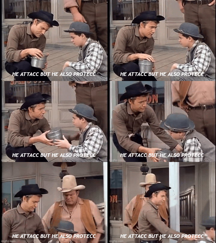

#the outlaws episode was in black and white even though it came later#bc bonanza was ahead of its time#anyways#thanks for the ask!#thejonderettegirl#wip: lasater kansas#will see if tumblr lets those images upload#also sad i didn't gif more moments when i made these#to be clear: i laugh at Several of the melodramatic moments in these episodes#but i still love him#also the outlaws ep version of him is much harder#but i have decided to chalk that up to him being in enemy territory the whole time
12 notes
·
View notes
Text
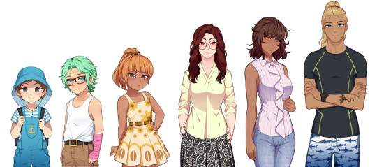
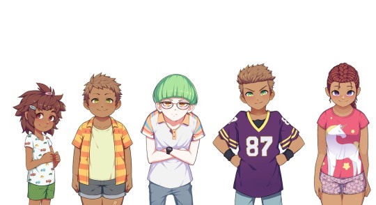
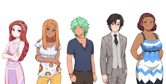
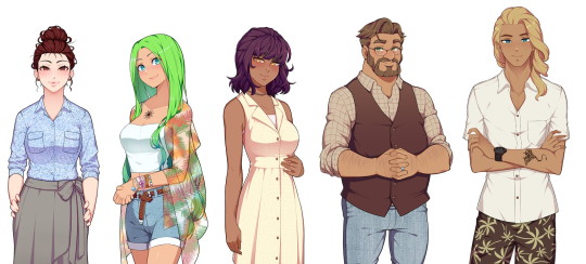
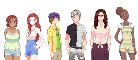
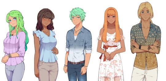
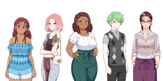
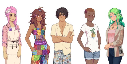
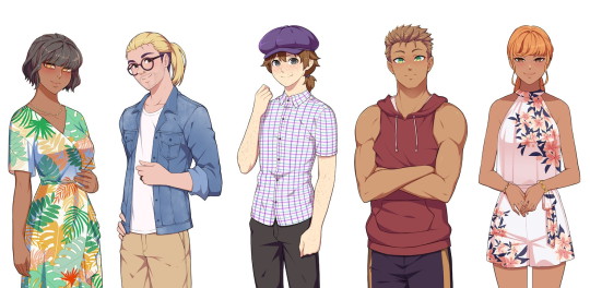
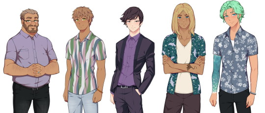
A character reference based on all four Steps of Our Life! It's only "sort of" a height reference as well since obviously they're not 100% accurate (the devs don't have specific heights for everyone to my knowledge).
I did dig into the code to try and get characters at their "normal" heights but there are other matters at play too (example: Nicolas is obviously "taller" than he should be because he needs to be pushed upwards to be visible enough above the game's text box; likewise with other very short characters).
Still, this should serve as either a nice reference guide for every character or a "height reference" in the sense of getting an idea of which characters are shorter/taller than others.
I'm also going to detail some extra notes below the break, including posts from GB Patch's Tumblr that reference any defined heights (with Cove being the obvious one) or general height things, as well as some more stuff about the MC's height in comparison to the three love interests depending on what you pick.
Cove's height is listed on GB Patch's FAQ as 4' 1" in Step 1 (also stated as "mostly average, perhaps a bit on the short side"), 5' 4" in Step 2 (in-game this is defined as "very tall" on the MC's potential height spectrum, as that is the only option considered on par with Cove's height), 6' 0" in Step 3, and 6' 4" in Step 4. A fun fact is that Cove's final height was originally 6' 3" (191cm) instead.
Derek in Step 2 is under five feet tall (this post also lists Cove as "around 5 and a half feet tall" which you could take as either close enough to 5' 4" as stated above or a potential original height he had that got changed). In-game, he's "short" but not "very short", as having your MC be "very short" will prompt narration telling you that you're shorter than Derek, whereas "short" only has you relate to him in smolness generally.
Step 4 Derek is "mostly average." He wouldn't be considered tall nor would he be considered short. His youngest brother Nicolas will "probably end up as a similar height to him" once he's more grown up.
Step 4 Baxter is "taller than average, but not especially tall."
I've been informed that, on the Our Life Patreon Discord, Step 4 Derek's height is listed as 5' 9" (175cm) whereas Step 4 Baxter's is listed as 5' 11" (180cm), so those are their defined heights. Before that, both of their heights had jumped around somewhat. A post from 2019 said that Derek was 5' 11", but a post from June 2021 said that Baxter was 5' 11" and Derek was 5' 9" (so consistent with the Discord). Then there's also another post from July 2021 (you'll have to scroll down for this one) that listed Baxter at around 5' 10" while Derek was 5' 8"/5' 9". If you're insane enough to try and use the character reference too, then Baxter would actually be around 6'1" at minimum since he's taller than Step 3 Cove (though you could also make the same argument that this means the mom trio of Pamela, Noelani, and Kyra must be decently tall as well since they're so close to Cove on the character reference).
I don't have any experience with GB Patch's other game, XOXO Droplets, so I don't know what ages the characters are in it, but since both Shiloh and Jeremy are characters seen visibly in Our Life, I thought I'd also mention that they're listed as 5' 10" and 5' 5" (or 5' 5 1/2") respectively in XOXO Droplets. Jeremy also apparently grows to 5' 8" in his 20s and he's 22 in the Our Life Cove Wedding DLC (I don't think this is spoken of in the game specifically but he's labeled as 22 in the code).
As for the MC and how their height plays into things, "tall" and "very tall" as well as "short" and "very short" tend to be considered the same for the most part in the game's code. It's not that there isn't a difference at all (I would say it's still notable), it's just that sometimes the game may be more vague about height differences. My post about Errands references this where you don't need more athletic points due to being "very short" instead of "short" to give Cove a piggyback ride.
A guesstimate I'd make is that about 5% of the time, the game will take note of whether you're "very tall" instead of "tall" or "very short" instead of "short." Otherwise, you're either "generally tall," "average," or "generally short." There are also other instances (usually with Cove) where the game might just check if you're either generally tall (around Cove's height) or not generally tall (i.e: definitely shorter than him).
This is actually relevant to the heights because, following all above information, one would assume that Step 4 Derek is average, Step 4 Baxter is tall, and Step 4 Cove is very tall going off the MC's potential "height spectrum" of very short, short, average, tall, and very tall, but it's not entirely the case.
A "tall" MC (generally tall) will look "down" at Step 4 Baxter just as he will look "up" at them or they'll look directly at each other if the MC is "average," same as Step 3 Baxter, but--
when the game has any instance of differentiating between "tall" and "very tall" (they never do this for Step 3 Baxter so the base assumption would have to be that he's just average height), things change.
During Baxter's apology in the wedding of his Step 4, Baxter dips his chin to look at the MC if they're "short"/"very short," levels his chin to look at the MC if they're "average"/"tall," and then lifts his chin to look at the MC if they're "very tall." A generally tall MC still has to lean down to kiss him if they choose to do so though.
Also, during the intimacy scene with Baxter (either in his office or his living room), if the MC is "very short," "short," or "average," it states that Baxter is taller than them. If they're "very tall," then Baxter is shorter than them, but a "tall" MC is "almost the exact same height" as him.
This is all a really long-winded way of saying that GB Patch referring to Step 4 Baxter being "taller than average but not especially tall" might mean that he's some infuriating middle ground between average and tall where he's not quite one but not quite the other either (which honestly is very Baxter of him so I can't even be mad).
#type: helpful#type: cracking the cove#our life#olba#our life: beginnings & always#((If you line up the images yourself then make sure the height of the original images are all the same))#((I don't know if Tumblr squished any.))#((Let me know if I'm missing anyone!))#((I know there's Step 3 Jeremy and someone named Cala in Derek's Step 4 (haven't gotten there yet)))#((but you only see those two on the phone so there is no ''default'' position/size for them.))#((Also I was worried that Tumblr would eat the quality if I uploaded such long images))#((so I separated Steps 2 and 3 and 4 into multiple images.))#((Hopefully that's fine; if you line them up side-by-side it still works out.))#((Me feeling so exposed because now how I design my Coves is here for everyone to see.))#((Feel free to judge my bias towards the color blue.))
739 notes
·
View notes
Text
Dad's Cam Show (Re-uploaded)
Note: This is a story I wrote in 2020 that was previously deleted by Tumblr. Couldn't find it until I stumbled upon am old hard drive. Hope you enjoy.
--
This social distancing shit is so boring. I get it. It’s needed. But god damn am I running out of things to do. Can’t even meet the guys I’ve been talking to on Grindr. Worse yet is that I’m stuck back at home. I was supposed to graduate college this year! Instead I was slumped over a computer screen in my PJs with my dad making his special pancakes. Ugh. Fuck this shit. I just wish I could go back to a better time.
Whatever. I’m done complaining. Dad’s getting groceries which means I can snoop around his shit. Yeah I’m that bored.
Dad’s a big burly guy. Heading into his mid-forties now and starting to gray up a little, but still keeping his body builder life style. He’s pretty open with me. He told me he used to do cam shows back before livestreams were even a thing. Made sense. Had to show off the bod somehow. Don’t know how mom thought about it but whatever. She’s out of the picture.
His room always had a musky woodsy cologne-y smell. His laundry hamper was even better. I always loved taking his briefs out of there and putting them on myself. I’ve been following his footsteps and bodybuilding myself, but I’m still a ways away before I have an ass and waist as large as his. So his 36in undies droop a bit. I grabbed his black cap too. Man. He loves this thing. Well, plus the 10 others caps he has. He always had it topping his head. Pretty sure he wears it to sleep too. I put it on and flexed like him. I got a bit of a boner but nothing crazy.
His dinosaur of a laptop was open, and logged in. I know I shouldn’t have, but I did it anyways. There were so many folders within folders. So much boring shit… and then I found “cam pics.”
The briefs I was wearing tented and wetted. Fuck I was so scared to open it. But I clicked it and… In there was only one image. I clicked on it to make it bigger and it was my dad. About 13 years ago. He was shirtless, and wearing the same cap that I have on my head right now. My eyes drifted from his hairy arms to his chest to eventually his bearded face. He looked so… tired? There was something about the softness in his expression that really got to me. And then…
“Hey son! I’m home! Could ya help me with the groceries?”
Shit. I got up and scrambled. The briefs were soaked and still being soaked. I had so many windows to close out of. Then I started hearing his footsteps come closer. I panicked and grabbed the top of the laptop to close it, but I couldn’t move. Suddenly, all the windows on the screen started to close. All except for the image of dad I had opened it. It enlarged by itself, and then the laptop started to fucking shake. I tried to get it to stop but it just kept rumbling. Fuck it. I wound up my fist and punched the screen. But there was no impact.
In less than a second my body followed my wrist into the screen. Everything went bright, and I was in a different room. I looked around. It looked like my parents’ room at our old house. The same laptop was in front of me showing the same image as before. Dad’s younger face looking back… And then I saw his eyes move. I froze. I looked at the time. 12:56 turned to 12:57. This wasn’t an image. It was a fucking livestream.
I slowly tilted my head. Dad did the same. I widened my eyes. So did dad. A smile crept over our faces. I just time travelled! And into dad’s body! Fuck there was so much I could do now!
“PING”
A old-school AIM notification popped up on screen. I maneuvered dad’s hand to the mouse and clicked on it. “Hey daddy. You gonna give us a show or what?”
“PING”
“Let’s see those hairy pits man!”
Fuck. I guess dad wasn’t kidding about these cam shows. Shit how do I reply? Do I just say something?
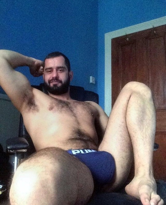
“Uh…” I gulped. Dad’s gruff voice was in my throat. “You guys mean… uh… this?” I lifted and flexed dad’s right arm. Immediately his armpit hair bursted out. Moist and smelly. My nose naturally turned towards the sweaty pit. Holy fuck was it musky. I took a deep whiff and groaned.
“PING. PING. PING. PING.”
“Fuck yeah daddy. Sniff that pit.”
“God damn you’re a big guy. How’s it feel huh?”
It felt amazing being so big. Watching everything I was doing be reflected by my dad on the recording was even better. The cockiness came in.
I wheeled the office chair back and did a double bicep pose. Sweat dripped off his hairy pits. I gave my face a rub and felt his beard scratch against his callused fingers. Then my hands felt the need to go down to his chest. I never felt so much pleasure from nipple rubbing in my life. The pings kept on coming. It was euphoric.
Dad’s cock was tenting the briefs I had put on earlier. I uncaged his 7 incher and let out a whiff of junk musk that filtered into my nose immediately. I started stroking and couldn’t stop. My other hand reached under dad’s taint, through the forest of pubes, and rammed a dildo into my dad’s ass crack.
“PING. PING. PING.”
“Holy fuck this is new! We gonna see a fingering show today!?”
“God damn man you enjoying yourself?”
I was. Everytime Dad’s moans left my throat I felt cock twitch a little bit harder. It just felt so amazing to feel his beefy arms rub against his beefy chest. His toes curling with every electric shock of pleasure moving through his beefy ass and legs.
I shot his load. Let out a gutteral yell. And it didn’t stop coming. My beard was soaked with three shots of cum. Chest was drenched with eight more. At this point, sweat was trickling down my temples. I relished in dad’s orgasm and then relaxed in the chair.
I watched as the notifications went crazy. Dad’s soft eyes housing my consciousness. Ugh. It felt incredible. I glanced over at his hat and felt the need to take it off. I did, and felt a wave of cool relief come off my head. Dad’s hair was cropped short, like a messy crew cut. And it was dripping with sweat. I felt the need to say something.“You like that, men?” Dad had so much suave in voice. The pings accelerated.I smiled and played with my cock. I could feel another round coming but felt a bigger presence unfold. Suddenly dad’s body started to shake. I tried controlling it, but I couldn’t weigh him down. My arms were flailing before my hands grabbed onto the edges of the desk. I whipped my head back, then head-butted the laptop screen. Light filtered through.
I was back at home, in my dad’s loose fitting briefs, his cap nestled on my head. Dad’s footsteps came by, then turned another direction. Guess he wasn’t coming by his room just yet. I looked down at his briefs, now soaked with my cum. Fuck. Was it just a dream?
It must’ve been. Just a fucking horny fever dream. What the fuck ever. Better than what I had been doing up until now. I leaned over to close the laptop but noticed something.
The image had turned into a recording.
501 notes
·
View notes
Note
Can you please describe how cohost works? I remember having to pay for it, but idk if that's still the case, and is similar to Tumblr so that it'll be fairly easy to navigate?
September 25th, 2024: In case you missed the news, Cohost is shutting down at the end of September. I'd just remove this post but I want people to be able to refer back to it since it's probably going to wander around headless for a while after since this platform is so good at that.
The nutshell version:
You don't have to pay. When I signed up there was a waiting period between registration and being able to post. I have no idea if this is still a thing, but when I did it, it was about a day. (There's a Cohost Plus thing you can pay for but it's not mandatory and is presently only really for increasing your max upload size.)
It works a lot like Tumblr. If you're used to using this place, dollars to donuts you'll be able to use Cohost without any issue.
There is presently no algorithm, so no real built-in discovery. If you want to find stuff, search the tags and you'll probably find whatever you like.
You can hide 18+ content if you don't want to see it. This is, of course, dependent on people actually flagging their stuff as 18+, but as far as I've seen everyone's been really good about that.

The toggle is right inside the post box. Dead simple.

Bonus junk -
If you hate the color scheme but you use the Stylus extension, install this theme (https://userstyles.world/style/7690/cohost-theme-customizer) and you can make it any color you want.
There are no metrics. No way to see how many people have liked or reblogged your stuff, and no way to see how many followers you have. Some people hate this. I like it because it shaves some of the stress off.
You can toggle a bunch of things on other people's blogs depending on what you want to see.

There are no themes, but you can put images and junk into your sidebar, so you can still fancy up a bit.
As I mentioned in a prior post, you can make side-blogs, and those side-blogs all have their own feeds. So if you don't want your peas touching your potatoes, you don't have to let them touch.
There's probably more but that's about all I can think of right now. No, it's probably not a perfect solution for everyone and hopefully I'm not billing it as that. But it's great for people who love dicking around with HTML and CSS and just generally not being bothered by the kinds of crap we've gotten used to here and in other places so maybe some folks'll like it there.
242 notes
·
View notes
Text
How to have animated rentry graphics with semi-transparency!!
Have you ever had this problem? You find this super pretty clipping mask that you wanna use...

...But when you try to save it as a gif, it suddenly breaks the pretty blurring?

So, let's talk about APNG:
APNG (Animated PNG) is exactly what it sounds like: a png that can be animated, with all the benefits of our beloved png format!! Such as unlimited colours!! Bet you didn't know this could be done!
Actually, you probably didn't know that for a good reason: APNG does not work everywhere. For example, I&'m not using it in this post because the animation won't work on Tumblr. It also doesn't work on old browsers, which you can check here if yours supports it or not:

However, even if the animation doesn't work, it will show the first frame as a still image!! So even those on older devices will still get to enjoy the graphic!!! (unless like... you want to do a fade-into-existence animation where the first frame will have nothing... but those are uncommon anyway)
But for this post, what's important is where it DOES work, and that is image hosting websites like imgur or catbox. And so, by extension, it will also work on Rentry + its forks!!
So how does one actually make an APNG?
Ezgif:
Note: DO NOT CONVERT GIFS TO APNG! It's useless because the gif file does not store any information about transparency, has less colours/lower quality, and you'll be needlessly removing backwards compatibility.
Go to APNG Maker and upload your frames individually. Check "don't stack frames" and make your APNG.

Photopea:
Works normally same as if you would save a gif. File -> Export as -> PNG. (You do need to have the frames layers in a folder same as you would for a gif)

Photoshop and Ibis Paint:
Unfortunately, Photoshop and Ibis do not let you just export as an APNG like that. You'll have to save each frame individually and then import them into Ezgif or Photopea.

As you can see, it's that simple! If you'd like, you can see a rentry template I& made using this the example APNG I& was showing throughout the tutorial here. I& was not able to find who made the overlay mask in the first place but a frame version of the cherry blossoms there did show up on adobe stock when I& tried to reverse search it so all they did was fill in a circle in the middle anyway.
Lastly, I& wanted to address one more question:
Why not use WEBP and/or AVIF instead? They offer the same benefits!
Well for one, fuck Google and fuck WEBP all my& homies hate WEBP. But for two, APNG has the benefit of backward compatibility: it's older (supported by more browser versions) and if the animation doesn't work, it still shows the first frame of it. WEBP and AVIF, on the other hand, don't show up at all/show alt text.
That's all, happy APNGing!
#rentry#rentry graphics#editblr#rentry tutorial#tutorial#edit tutorial#graphics#pfp masks#clipping mask#apng
145 notes
·
View notes
Note
moodboard tuto pls? like how to do the layouts
𐙚⠀͡ moodboard layout tutorial ੭ ꒱
hii i'm not sure if you mean the layout of the actual moodboard or the
text in it that goes in between the images so i'll do a short tutorial of both ^^
let me know if you have any questions afer reading this :')
moodboard tutorial
when i make my moodboards, i follow a simple process :
• look on pinterest for an icon you like and want to use in the moodboard
• after you find the icon you want to use, make note of the most significant colors in the image and what aesthetic / theme you want the moodboard to convey
• then, go back to pinterest and search for those colors and themes - i would do this by inputting [ color ] [ color ] [ adjective ] [ aesthetic ] into the search bar and scrolling through the results to find images you like and you think will fit the moodboard.
ex. white pink soft aesthetic or soft white pink aesthetic ( you can add as many colors as you'd like, it just might be a little harder to find good results )
• after i find the images i like, i try to arrange the moodboard on my laptop's desktop but you can use whatever you want to experiment with the arrangement of the images.
• when i'm satisfied with the arrangement i've made, i upload the images to tumblr and copy the same arrangement.
• you can choose to end here and upload / post the moodboard as it is, or you can add dividers or locs ( symbol layouts ) which will be the tutorial below !
locs tutorial
making locs is pretty simple, all you need to do is find symbols to match the aesthetic you're aiming for with your moodboard and then arrange them in an eye-catching and reasonable way. you should also try to make it look balanced, however some locs look great even if it's a little unbalanced.
i usually search pretty symbols or cute symbols to find symbols to use and here's a short version of my process for making my locs :')
let's say i want to make a layout that gives off cutesy vibes, here are a few symbols i think would look cute if arranged together :
♡゚ 𐔌 ⏖ 𐦯 𓏸 𓄹 𓄼
after i find the symbols i want to use, i experiment with different arrangements. here's the one i made and felt satisfied with :
𓄹 ♡゚ ⏖𓏸 𓄼 ⌢
( this is how it would be spaced out in a moodboard )
as you can see, i got rid of some of the symbols i originally chose and added a new one. i also combined two of the symbols but that's not required, i just thought i'd give it a try lol :')
you can also make a set of locs for one moodboard if you want there to be more of a variety but that's completely up to you ^_^
that's it for this tutorial, lmk if you have any questions and tysm for sending this ask !
𐙚⠀͡ i hope this tutorial helped everyone who needed it ! ੭ ꒱
#locs tutorial#moodboard tutorial#cute#locs#layouts#symbols#cute symbols#tutorial#aesthetic#helpful#cute layouts#aesthetic layouts#asks
85 notes
·
View notes
Note
i hope this hasn't been asked before. what size do you make your canvas? and do you crop it to fit other socials (like Instagram for example)? i hear that 300 dpi is standard. i never know if it's good to make my canvas big or not.
hi i think this ask is like at least 4 months old but i was scanning my sketchbooks from last year and i abruptly remembered i had gotten this ask because i had made a little chart in my sketchbook trying to figure out how to answer it
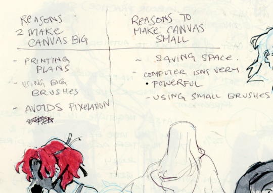
anyways theres pros and cons. and the size of your canvas is really going to depend on personal needs + preference. how good ur computer is, how complicated ur art style, how comfortable drawing feels, how much disk space you have to spare, what youre gonna end up using the art for in the end...300dpi is standard for PRINTING specifically, if you only plan to ever post things online then 72dpi works great and will save you space (fun fact a lot of professional animation files i deal with are 72dpi. and those eventually go on your tv screen). but personally i make everything i draw 300dpi because i am always printing stuff for cons, zines, etc and its nice to have the option even if i dont end up printing.
when I was a teen I used to draw on a rly shitty laptop and i made everything 800x800px 300dpi because big canvases would cause a lot of lag and also the resolution on this laptop was pretty small so 800px was a lot of the screen already. now i have a slightly better laptop with a bigger resolution and i sketch on giant 10000px-40000px canvases with the hard round brush and no shape dynamics or transfer whatsoever to minimize lag. when it comes to making a final illustration when i know ill be using a bunch of layer effects/blending modes/colors/mixing brushes etc etc ill generally crop the canvas down to the 6000px range. most illustrations i try to make sure are comfortably printable on tabloid size paper so thats pretty much anything hovering around or above 3000x5000px w 300dpi (so 11x17in). HOPE THIS HELPS?
EDIT: OH ALSO re: socials. i always ALWAYS size down my art to post on the internet. i think its crazy when other artists dont. because why would i ever let the internet have my hi-res file for free. also in general i think it looks better if you do the resizing yourself because if you don't then many social media sites will compress your file for you! a lot of people will post a hi-res file to twitter and then go "Wow twitter killed the quality of this img!!!" UH YEAH because they have an automatic image compressor. because they need to save space too lol and they dont want your image to take 248263895 years to load. same with instagram and to a lesser extent tumblr. when i post anything on social media i resize it down to 1200px-1600px on the longest side... its a little arbitrary but im kind of basing it on the smallest resolution of widely available screens. mostly because i think it looks stupid when u open up an image file fullsize and u have to scroll to see the whole thing... also iirc instagram only takes images up to 1080px before it resizes them? granted if you upload something smaller than that itll also resize it up which will look worse so I think bumping the numbers just over 1080px is pretty safe.
I should really be bringing the dpi down to 72 too when i post online but often im too lazy to do that. but it will technically help ur image load faster and stuff. and make it less likely for people to yoink it off the web and print it themselves.
147 notes
·
View notes
Text
Another Beautiful Day (First Years x Yuu)

(gif taken from google, originally uploaded to tumblr but user apparently deleted)
You have been having strange dreams lately. Every time you go to sleep you se the same set of flashing images, a carriage ride, a crumbling castle under a ink stained sky, ending in the jaws of a monster. The pain you feel from the flames makes you wonder, on nights when you are alone in Ramshackle with Grim, if those dreams are less fiction and more of a memory.
You are not the only one who has those dreams. There's another, laying awake in his bed, hand clutched tightly over his frantically beating heart trying desperately to hold the fraying edges of his sanity together. How many times has he done this? How many times has he tried to hold onto the last fleeting traces of warmth in you with his cold, unworthy hands.
Again. He loves you, that is the one thing that refuses to change no matter how many times the world is reset. He loves you, he has no choice but to try again.
notes: they/them pronouns used for Yuu, hurt almost no comfort, borderline yandere behavior. If this made you feel something you can check out the other parts on my masterlist.

Ace
There was, perhaps still is, a pretty viral theory about Ace being a traitor involved in resetting time. While I can't ever see Ace purposefully causing Yuu's death ever, I can see him deciding that if he has to play the villain to get the outcome that he wants, well then, that's just what he's going to have to do. Ace knows how to annoy people, comes with the youngest child territory, more specifically he knows how to annoy you. He can stand having no one if it means everyone's focus is on keeping you safe, it's easier to admit that he loves you when no one's around to hear it. It occurs to you that he might, it even crosses your mind that the strange dreams your time-loop troubled subconscious is so desperate to hang onto, ones where you are with someone you love dearly, could be about him. How else would he know how to push all your buttons, why else does he always know when and where you'll be in trouble. If Ace doesn't love you, why does he know all the things you like about this world before you do? It's a painful thing to be known, even more so if the person who knows you refuses to let themselves be vulnerable with you. The more things change the more they stay the same... huh?
Deuce
Ever watched Tokyo Revenges? I know some of you have, I can see you. Anyway Deuce might not be a crybaby but he is loyal, determined, and stuck on desperately trying to save you. Well not just you, Deuce realizes that Overblot Grim spells doom for a lot more people that just those inside NRC. Sage's island might be remote, but people still live there, if the monster got out who knows what sort of damage it will do? He tries his best to be normal around you, to befriend you and protect you in just the same way he did before, but he's a much more serious and moody person than he was the first loop around. How is he supposed to explain to you he couldn't save you, that he's watched you die countless times and only had ashes to hold and cry over? Not just you either, he's seen Ace and Epel and Jack, hell even Sebek, Die over and over again because he wasn't smart enough to stop it. Ace manages to pick up on something being wrong, and Deuce being Deuce he fails to lie properly, "dragging him into his mess." But he can tell Ace doesn't mind. He takes his impending doom as a challenge, encouraging Deuce to do so as well. He's stupid, he should just give up and let someone smarter save you. But he's your stupid, kind of crybaby hero. He'll save you, just you see.
Jack
Trying to save you is as much an instinct to Jack as it is raw emotion. You are his soulmate, there is nothing casual about his investment in your relationship, nothing short of divine intervention that will keep him from trying to save you. But he will admit he feels rather unprepared for this... development. It's all well and good to say you will break reality before he lets it take you from him, but actually being strong enough to do that? Jack's a good boy, but no matter how smart he is he's a bit of a muscle head. He throws himself into problems fist first, without any back up unless someone yanks him by the scruff and forces him to look at it. Usually that's you, sometimes it's Ruggie or Leona, but in the past it was you. He knows he can't keep himself from you, even if that could make you safer. Unlike the first timeline, he makes sure to introduce himself as early as possible, makes sure to be with you for every overblot. You might find it annoying but he'll push you to train just enough so that you'll have the speed to run when the final monster comes. Maybe this time, he'll be strong enough to kill it before it catches up to you.
Epel
Sleep Kiss cannot put you to sleep forever. Yet. Yes yet, Malleus isn't the only one who thinks letting you nap forever is a good idea. Great minds think alike, and unlike Malleus's, Epel has an added bonus. He can encase you in a glass cage that is literally meant to protect you from anything that wants to hurt you. Not that you would ever expect this plan from Epel. He's cute, kind, non-threatening when you're paying attention, the most you see of his temper as the loops continue is the slightly bratty glare he focuses on pre-overblot housewardens. And the headmage, but hey any anger at him always gets a pass from him. Not that you need to worry about that, once Epel masters his spell you won't have to worry about anything. He does wonder if you'll be able to dream, the first time he cast his spell on you it was like you didn't realize anything had happened at all. Maybe he won't tell you anything, maybe he'll wake you up every once and a while to convince you that you were never asleep at all. But that's not a concern for now, all you need to do is close your eyes and sleep. Sleep and wait for your Prince to return from the war.
Sebek
Following the current timeline, events aside, Sebek is on the outside of your friend group. No one likes him, he can't sit with you. The only real reason Sebek has to pay attention to you is because Malleus does. And he has to admit he doesn't exactly hate what he sees, he just- doesn't want to give credit to a human. When time is re-set though, he goes out of his way to befriend you, convinced he needs to keep an eye on you to save his lord. After all, how could he not find it suspicious that Malleus befriends some random human from not-Twisted Wonderland and then suddenly overblots? He is ready to strike at the first sign of betrayal, but he does not find it. He finds a human, weak and flawed, but paitent and kind with him, unwilling to let him talk down to them but still willing to talk. You die, but you never stop trying. You refuse to let the flaws he picks at stop you from trying to live. You refuse, no matter how many times he yells about the amount of times he has lost his lord, lost you, to let him do all the work alone. There is beauty in your struggle, in your life. He can't betray this for his lord, even if it was the cause of his plight. It's Silver he turns to for help, begging him for guidance through tears as he desperately clings to you. He finds it of course, he never had to do any of this alone, but he should know by now that doesn't guarantee success, no matter how much he wants it to.

#twisted wonderland x reader#twst x reader#ace trappola x reader#deuce spade x reader#jack howl x reader#epel felmier x reader#sebek zigvolt x reader#i've never watched eva#stolen valor on this gif
269 notes
·
View notes
Text
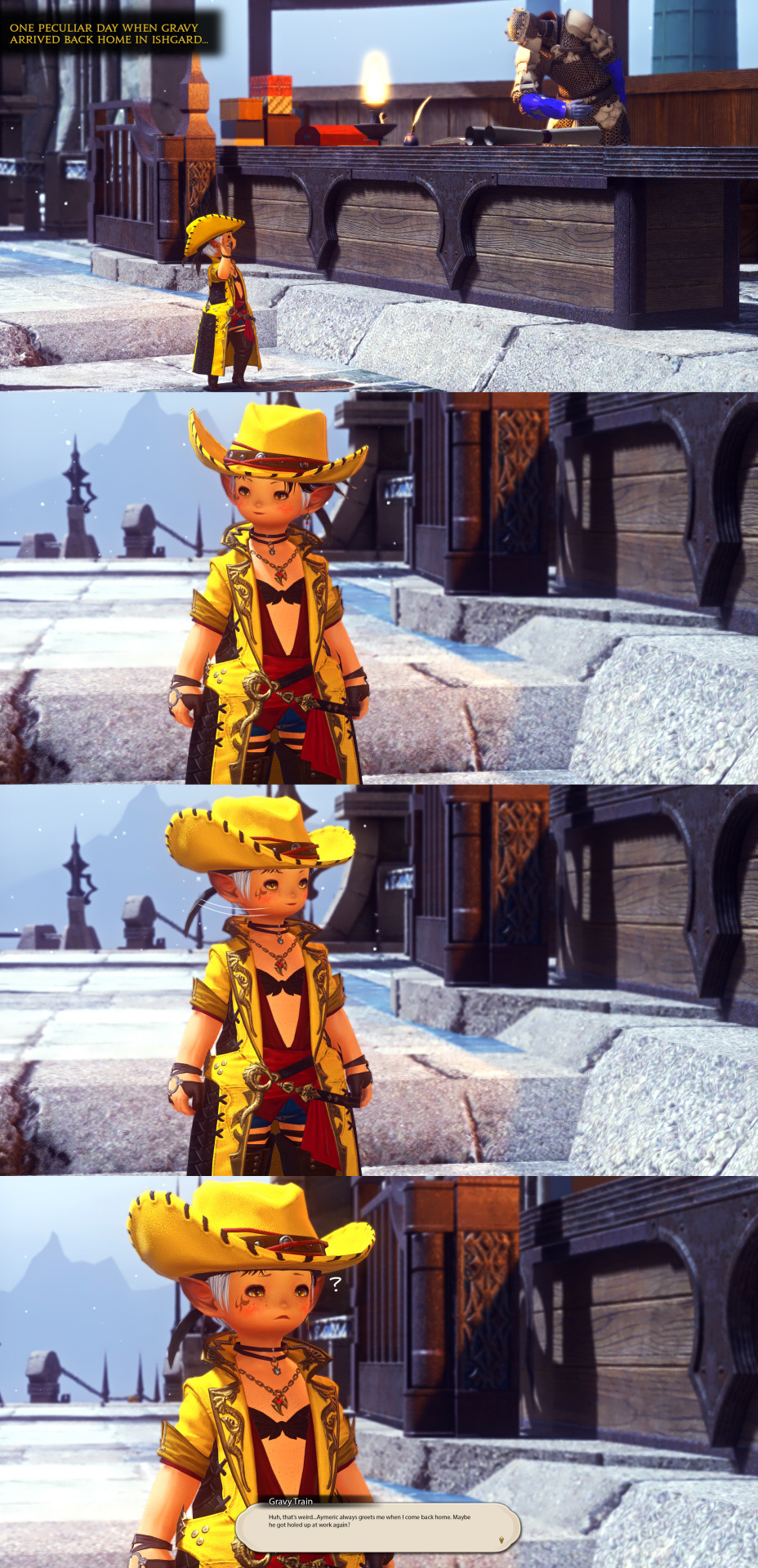
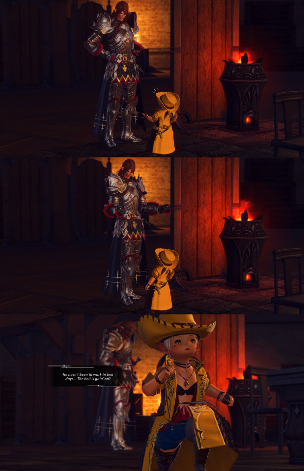
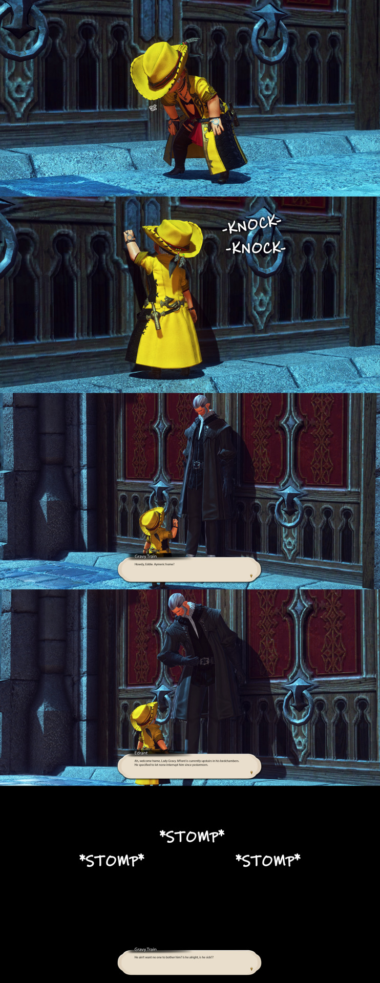

*jingles pathetically across the courtyard*
holy shit y'all, this was the most extensive set of gposes i've done yet. this took almost an entire week from me getting a room at my fc's crib and transferring all my shit from my apartment to there so i could make the bedroom, gathering/crafting everything for said bedroom, the poses themselves, desperately trying to find a crime for aymeric's earring before i said fuck it and photoshopped it on LMAO, the editing, putting the screenshots into panels since tumblr only allows 30 images per upload and finally typing up the transcript, I AM FINISHED.
all because a friend wrote a snippet about "what if aymeric fantasia'd into a lalafell?" i have not known peace since then 😩 /pos
btw i plan to make an introductory post for gravy sometime, but noT FUCKING TONIGHT PLS IF I HAVE TO OPEN PHOTOSHOP ONE MORE TIME I'M GONNA HURL MYSELF INTO THE AETHERIAL SEA
got a doozy of a transcript, find it below the break!
TRANSCRIPT
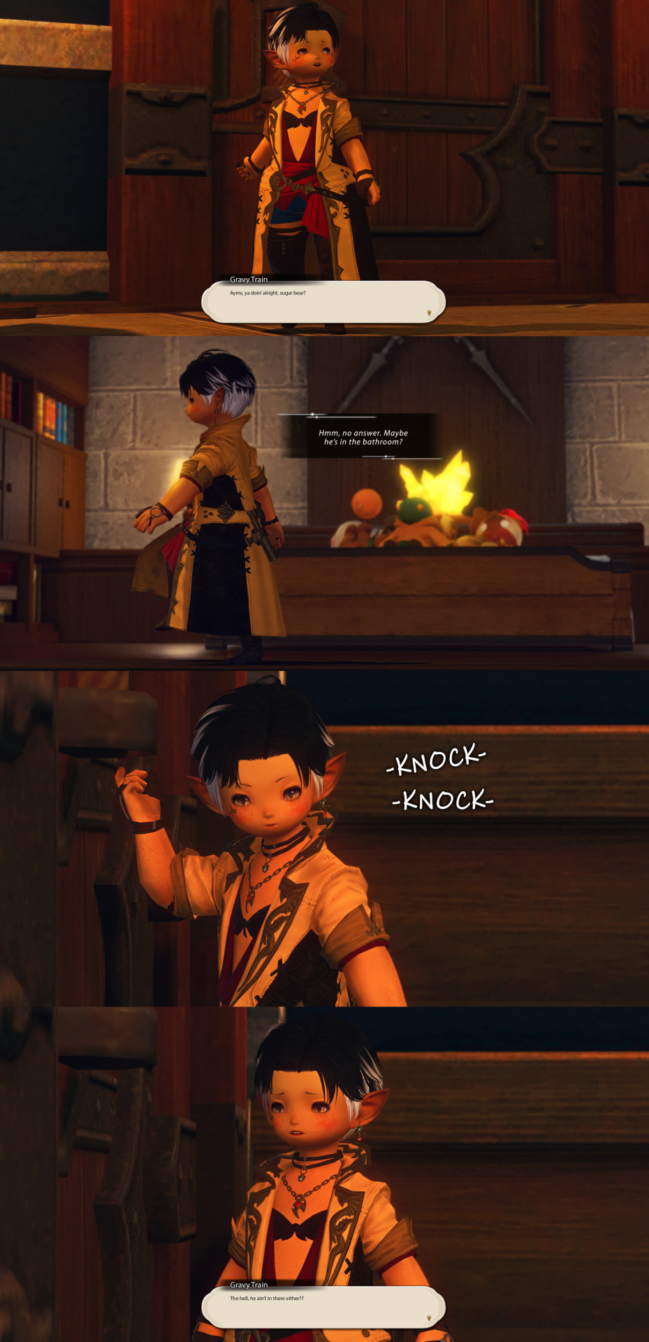
Panel 1: [ONE PECULIAR DAY WHEN GRAVY ARRIVED BACK HOME IN ISHGARD…]
Panel 4: Gravy Train: Huh, that’s weird…Aymeric always greets me when I come back home. Maybe he got holed up at work again?
Panel 7: <He hasn’t been to work in two days…The hell is goin’ on?>
Panel 10: Gravy Train: Howdy, Eddie. Aymeric home?
Panel 11: Edrant: Ah, welcome home, Lady Gravy. M’lord is currently upstairs in his bedchambers. He specified to let none interrupt him since yestermorn.
Panel 12: Gravy Train: He ain’t want no one to bother him? Is he alright, is he sick??
Panel 13: Gravy Train: Ayms, ya doin’ alright, sugar bear?
Panel 14: <Hmm, no answer. Maybe he’s in the bathroom?>
Panel 16: Gravy Train: The hell, he ain’t in there either??
Panel 17: Gravy Train: Now just where could he’ve gone off to? Surely if it was an emergency he’d’ve let me know somethin’...
Panel 18: Gravy Train: Maybe Estinien’s gotten into some shit that Vrtra couldn’t get him out of and Aymeric went to help? Or Lucia needed him in Garlemald? Naw, Lucia’s got her shit together, Estinien’d be the one who’d fuck around.
Panel 19: Gravy Train: Aight, that bastard better have his linkpearl in or I swear to goD–
Panel 20: ???: Darling, is that you?
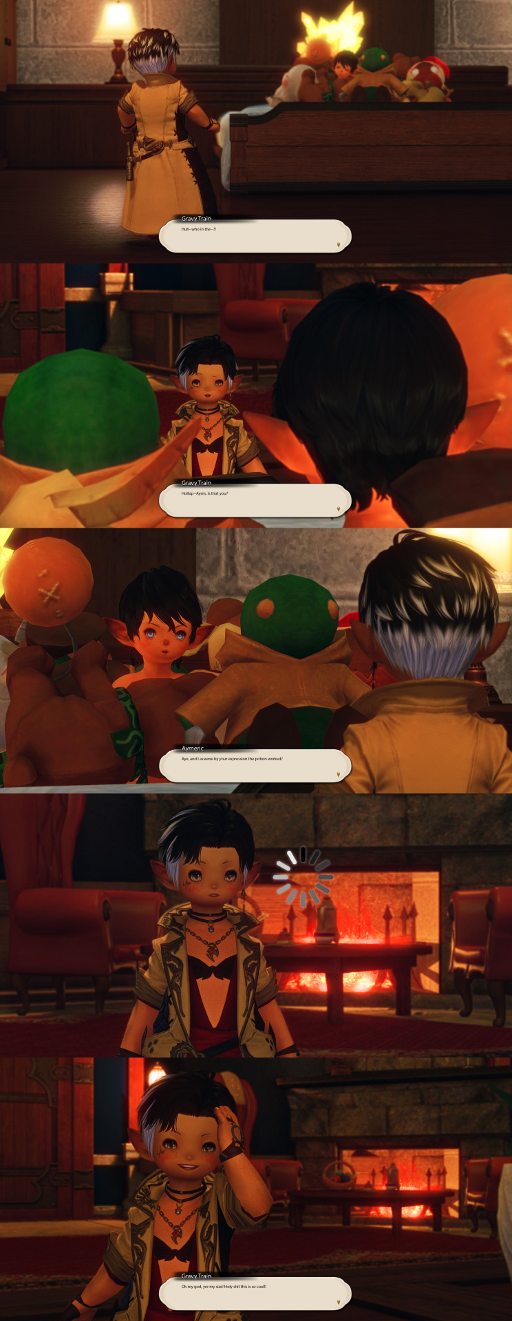
Panel 21: Gravy Train: Huh–who in the–?!
Panel 22: Gravy Train: Hollup–Ayms, is that you?
Panel 23: Aymeric: Aye, and I assume by your expression the potion worked?
Panel 25: Gravy Train: Oh my god, yer my size! Holy shit this is so cool!!
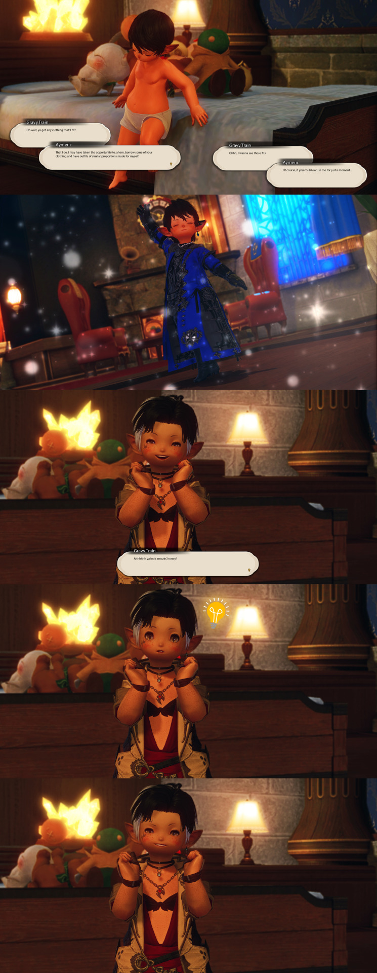
Panel 26: Gravy Train: Oh wait, ya got any clothing that’ll fit?
Aymeric: That I do. I may have taken the opportunity to, ahem, borrow some of your clothing and have outfits of similar proportions made for myself.
Gravy Train: Ohhh, I wanna see those fits!
Aymeric: Of course, if you could excuse me for just a moment…
Panel 28: Gravy Train: Ahhhhhh ya look amazin’, honey!
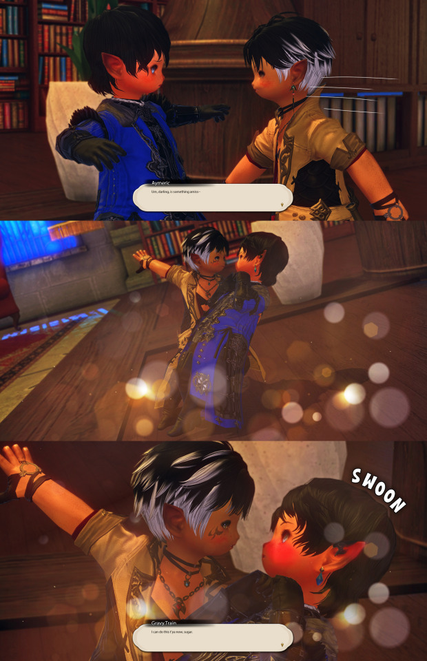
Panel 31: Aymeric: Um, darling, is something amiss–
Panel 33: Gravy Train: I can do this t’ya now, sugar.
#ffxiv#ffxiv gpose#ffxiv screenshots#gpose#gposers#ff14#ff14 gpose#lalafell#aymeric de borel#ffxiv memes#ffxiv shitposting#elezen#warrior of light#ffxiv wol#wolmeric#wolship#handeloup#estinien and vrtra mention#i assume the borel manservant is an old man since he's been with da family 4 generations#no clue wtf his name is so after a single ffxiv male elezen name search i found edrant and was like COOL UR EDDIE NOW#as long and time consuming as these gposes were#i really did enjoy making them!#i originally was just gonna do the bedroom shots at someone's open house#but when i found someone's i thought would fit i got way too nervous to ask if it'd be okay that i encroached on their crib#SO I MADE IT SO MUCH HARDER ON MYSELF AND JUST REDID MY APARTMENT LMAO#but it all works out cause it needed to happen anyways UwU#and now i have two areas that i can gpose in that i made all by myself!!!#PLS SE LET ME GET A FUCKING HOUSE#anyways hope y'all enjoy this long ass set!!!!!!
33 notes
·
View notes
Text

I think I got a lot of new followers recently because twitter keeps going to shit. However, as you probably know I can't and don't post nsfw art here.
You can find my NSFW socials on my pinned post. I think a lot of people are hesitant to join platforms which aren't fully available to the public yet but if you'd like to keep up with my nsfw art I'd like to:
Urge you to visit my website and subscribe to my RSS feed for gallery updates!
Suggest you follow me on either Pillowfort or Cohost (18+).
In the last year I have started using PF and Cohost more than Mastodon, as they've implemented new features and their posting system is more in line with what I enjoy: robust tagging and filtering, ability to post MANY images, and readmores for long posts.
If you've been hesitant to join either of those platforms since you don't know what to expect here's a small-ish review of both purely from my experience as someone who: a) enjoys profile customization b) likes to have an organized art gallery that is filterable by tags.
This review is aimed at artists looking for NSFW spaces to post! UI screenshots might have suggestive terms and images. Proceed with caution.
Edit: Good grief tunglr, if you open this on the web dash the images aren't shown in the neat galleries I put them in to make the post shorter. Head on over to the permalink if you'd like a better looking post!
Let me just say that if you're looking for a review on more technical aspects of these platforms, like security and moderation policies. I'm not your guy. You'll have to look elsewhere for that. I'm focusing on QoL UI and community aspects.
Though both these platforms allow nsfw, please make sure to read their ToS/Community Guidelines for rules on what is and isn't allowed. Though as far as I'm aware they have pretty similar rules.
Pillowfort
Overview::
Pillowfort has more years under its belt being available to users than Cohost does, as such I THINK the artist/fandom userbase atm is larger, which means you might see more activity there. UI as of right now is very comfortable and the site runs pretty smoothly. Loading times are very decent. Posting is easy, though the image uploader is a little wonky (they are working on fixing this). You are able to create and manage communities based on interests or themes, which people can follow or join and all post in the same space. You can personalize your profile by adding images, links, and formatted text to your sidebar, as well as customize your own profile colors. Tag searches in my experience yield results of both art and aesthetic irl porn and gifs. If that's something you miss from ye olden tumblr days it might be worth a look.
Pros:
Posts have privacy options (everyone, logged in, followers, mutuals, only me)
Has a DM system
Posts have Commentable, Rebloggable, NSFW toggle
Can post MANY images on a single post
Readmore feature for long posts
Robust tagging system
Robust filtering system: hide or click-through warning (by installing Tassel userscript only)
Customizable profile colors, Light/Dark mode for whole website
Communities you can follow/join for shared interests
You can filter posts on profile by tag
You can filter posts on profile by "original poster" or "reblog"
Cons:
wonky image uploader, cannot upload multiple images at once
Cannot search for multiple tags at once
Search for terms with periods in them is currently broken (ex. "D.Gray-man" will not yield any search results)
Communities have few moderation features atm
Without Tassel installed the filtering system is pretty garbage atm (you can either show or hide nsfw or filtered tags completely, with no click-through warnings)
No multiple account/side blog feature yet
Some inline image formatting options are broken atm
Default endless scrolling
No progressive web app for mobile atm
For a more in depth explanation of PF's UI and features you can check out this official post.
Here are some images of the UI.
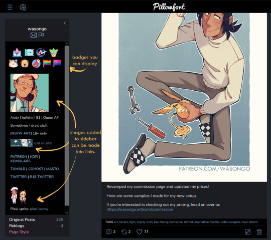
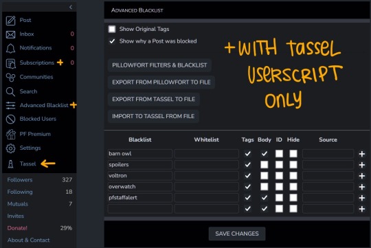
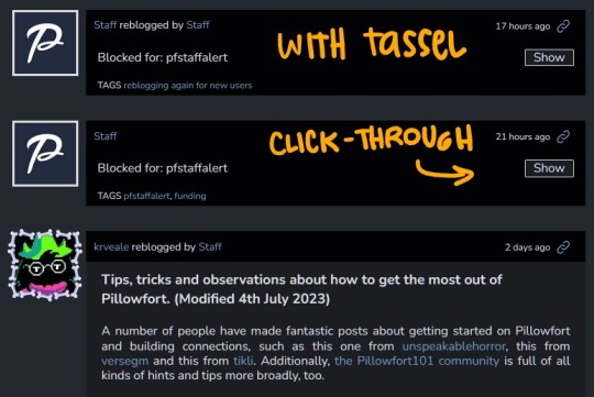
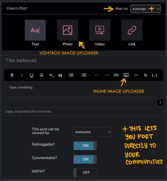
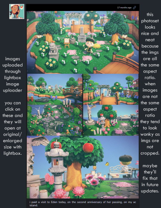
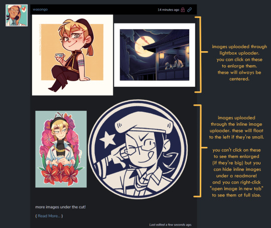
---
Cohost
Overview::
Cohost feels like it has a small artist/fandom userbase at the moment. However, to make up for that it has a pretty slick UI, it works great as a progressive web app on mobile, and it recently implemented an ASK system similar to tumblr's! Everything loads pretty quickly, and you can switch between your "latest posts" feed and your "bookmarked tags" feed. You can access your likes as a bookmark system, but as a whole "notes" and engagement numbers except for comments are not visible anywhere (this is wonderful for my personal mental health). It has a simple post editor and though the image uploader only allows 4 images that will load with lightbox, there's a workaround to upload MANY inline images if you want. The catch is you'll need to use a bit of markdown or html to do that. (more on that below) Though you can't personalize your profile colors, you can add personality to your page by making very cool pinned posts and adding images to your sidebar.
Pros:
Animated avatars! (listen i like having my animated komui icon)
You can make multiple "pages" (blogs) which function independently for comments/asks. switching between pages is effortless
Ask system, with anon toggle (you cannot reply privately atm tho)
2 Factor Authentication
Progressive web app for mobile works like a charm
You can preview your post before you post it
Posts have a NSFW toggle and you can save drafts
Can post MANY images in a single post (bit of a workaround as you'll need to upload your images to a draft first and then add them to a new post with some markdown or html code)
Readmore feature for long posts
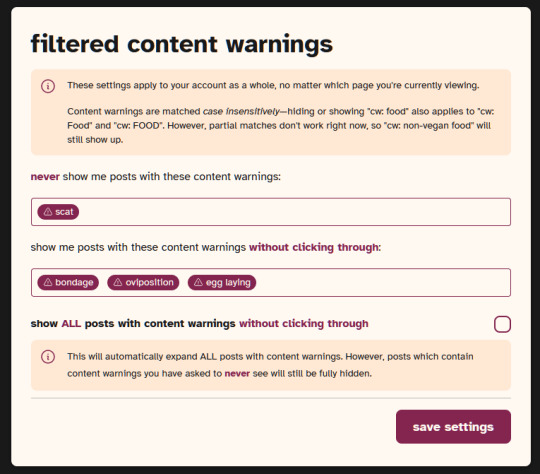
Robust tagging AND filtering system (show, click-through, hide completely), plus CW system to give your posts additional click through warnings you deem necessary
You can do incredibly cool things with HTML and inline CSS on your posts
You can filter posts on profile by tag, and you can have pinned tags
Toggles for hiding reblogs, replies, and asks on profiles
Paginated browsing instead of endless scrolling (things load faster)
No engagement numbers visible ANYWHERE
Cons:
Image uploader does not let you upload multiple images at once. Limit to 4 images (can upload more as inline images with code)
Advanced post formatting (ex. bold, italics, bullet list, inline images etc.) has to be done through markdown or html + css which is not the friendliest for those who don't know any code (there's a button for a markdown cheatsheet when you post tho!)
No dark mode, or customizing profile colors atm (however there are workarounds to changing site colors with Stylus extension)
Cannot search for multiple tags at once
Cool things you can do with CSS on your posts might look very bad on mobile
Since you can do some crazy things with CSS on posts, you might come across eye straining visuals and movement on some posts. There are settings to tone this down, and people are pretty good about tagging things, so with some good filtering you should be able to avoid this however.
A little quieter on the artist/fandom front (but we can change that)
Here are some images of the UI.

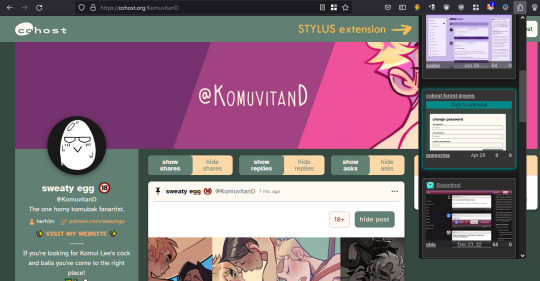
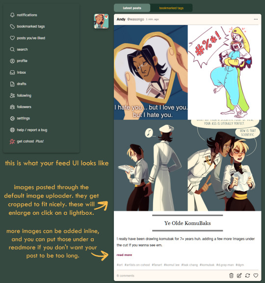




If you made it to the end of this review thanks for giving it a look! If there's something vital you might want to know that I missed in regards to UI and posting features let me know and I will try to answer. But again, this is not a technical/security issues/bugs review so don't ask me about that.
Lastly, I've been seeing a handful of NSFW artists I follow on twitter hopping on bluesky. I REALLY suggest you do a little research on the owners and platform to see if you think joining is worthwhile, since I have a feeling many artists might not want their alternative to be a site owned by crypto advocates (and also a billionaire). Some basic research will get you there. Just take heed and use your best judgement. On that note Cohost is strictly against crypto (I'm guessing PF might be too but I don't have a link that I can point you to confirming this atm).
I believe community driven and supported platforms are the way to go. If you end up thinking either of these two places are worth your time, do consider getting your friends and favorite artists on board or supporting them! You'll get added perks on both platforms if you become a supporter. PF recently added the ability to have MULTIPLE AVATARS (PFPs I think they're called nowadays) which I think is super cool (i really miss that from LJ days).
Again, thanks for reading and I hope to see some of you there!
242 notes
·
View notes
Note
were there any specific styles/cultures you took inspiration from when designing the telchin clothing styles?
Honestly the tricky answer is: a lot-
Initially, it was very much just like “okay does this shape and colour palette and design look cool? Sick” and just throwing thoughts at a wall.
When it came to defining those broader shapes/colours and adding things like specific cuts, details, patterns, etc, I sort of worked backwards to grab inspirations.
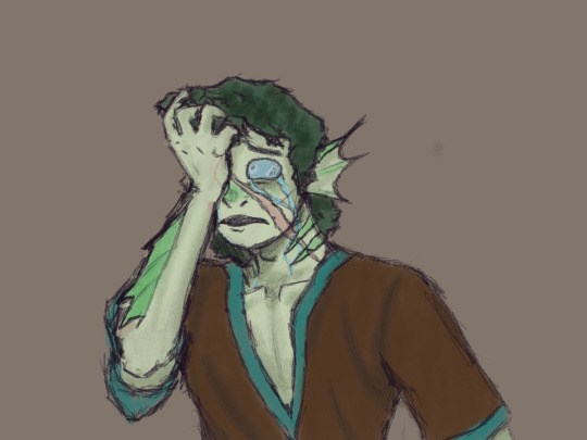
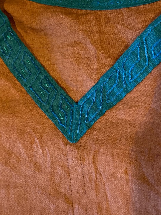
Ulysses initial/main outfit is honestly quite Medieval, European (but notably Norse/Scandinavian in its cut/style), albeit with a ridiculously plunging neckline for some reason lol-
(it was even a bit early on that every time one of the cast drew Ulysses, we’d make his neckline just a little bit sluttier)
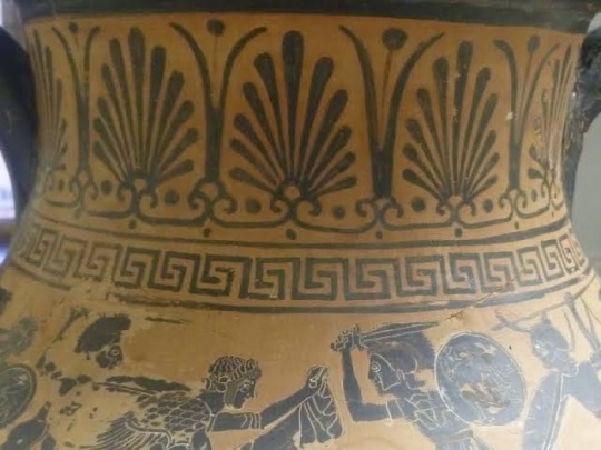
HOWEVER the details on the collar and sleeves are directly lifted from ancient Greco-Roman designs, specifically influenced by the “Greek Key” or “Greek Meander” pattern which can be seen in pottery, jewellery and architecture all over the ancient Mediterranean!

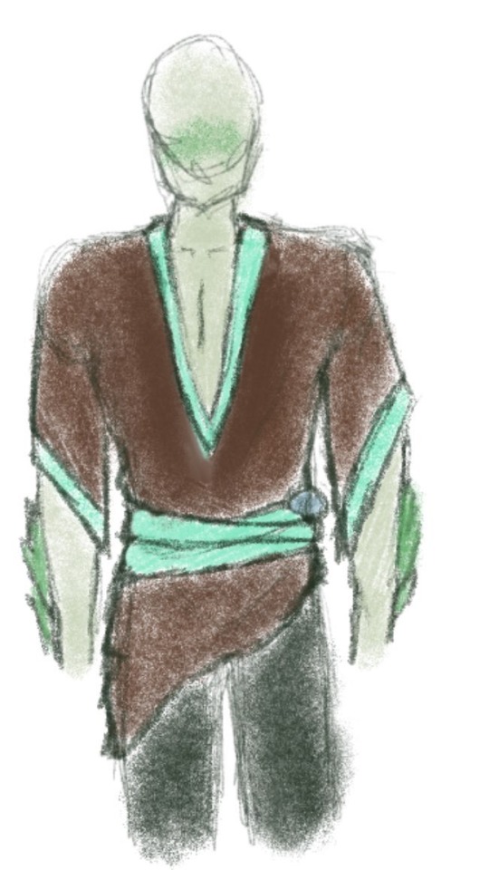
Specific to Ulysses, his clothing has currently reached a fairly fairytale-esque “fantasy” stage, drawing a lot of early Renaissance and pirate-style influences with his little poet-shirt and sash, since he’s been on the Overworld so much, and is slowly growing to become a part of that culture and world, and I really wanted to show that in his clothing changes.
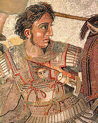
Honestly, a lot of the broader telchin clothing when I have sketched it up is very Greco-Roman, at least in the way I tend to depict it (that is my field of expertise, given my degree haha) but there’s honestly a lot of broader Mediterranean ties in as well. The army and their armour is designed to be very Ancient Macedonian, and a lot of the more casual clothing skew very Ancient Egyptian.

Canonically the Telchin clothing style also definitely develops rapidly over the course of the war with the drowned, mostly for practicality sake more than fashion (loose flowing fabrics aren’t doing anyone much good escaping the undead), leading to an almost 1950s/60s American aesthetic? Of course still mingled with the Greco-Roman patterns. Especially in the way the scientists are presented in lore/my art, they always had a very retro-60’s almost sci-fi scientist aesthetic. If I was to give it a fancy/proper-sounding name I think “Wartime-Americana Retro-Classicism” would be more or less it, potentially lmao-
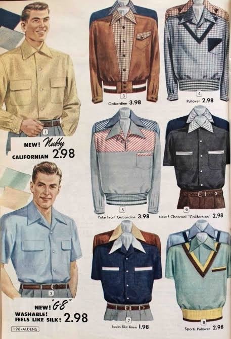
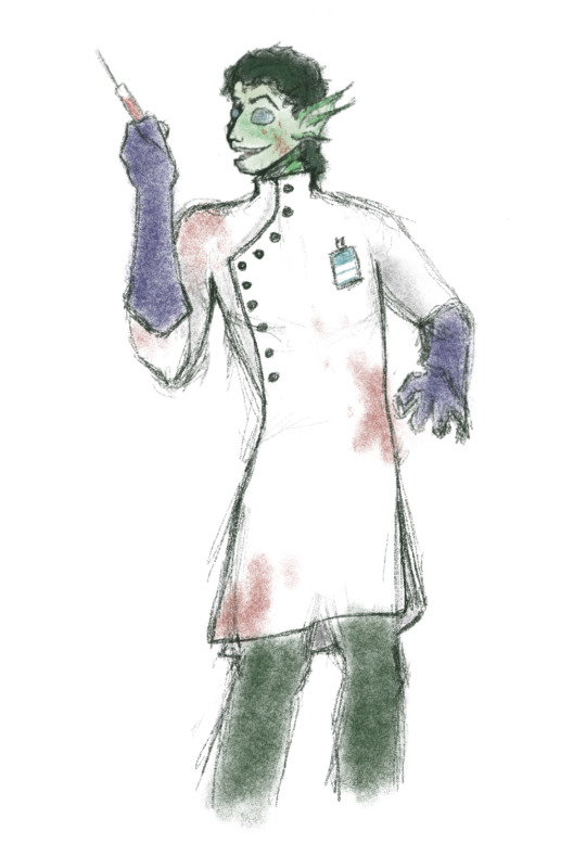

(You can even sort of see similar shapes and patterns in that first reference image to Ulysses eventual design!)
There was of course always a flair of Victorian-Mad-Scientist too, because I have a bit of a brand and I can’t help myself. And given the blurring of science, alchemy and magic in Fable I think it definitely fits.
It’s a shame Tumblr only lets me upload 10 images per post on mobile because I have A BUNCH of reference images for all of these stages of the Ulysses/broader telchin clothing design lol, but sadly I can’t include them here :(
But I hope this was somewhat useful/interesting!! I’ve had so much fun coming up with this kind of stuff over the course of Fable s3 for the telchin and I’m very grateful to Ocie and Metta for kind of just letting me go ham on a bunch of aspects like this lol-
57 notes
·
View notes
Text
COMPLETE OFMD S2 CONTENT LIST:
To anyone looking for a complete list of trailers, vids, and photos released for OFMD season 2, here ya go.
(I’m not rly active on anything other than tumblr rn so i’m sry if I missed smth)
! LINKS CONTAIN SPOILERS !
So, first of all we have the official teaser trailer, released on August 30th: TEASER LINK
On September 14th we finally got the full length trailer. I’m assuming we’ve all seen these already: TRAILER LINK
There was a promo vid containing new s2 scenes that some people were getting on their TVs and recording and uploading to twitter. What some people don’t know is that that the official OFMD facebook account recently uploaded the same promo thats actually good quality and not just recording off a tv screen. Anyways if there’s a scene you’ve been seeing but it wasn’t in the trailer or teaser, its probably here: PROMO VID LINK
Here’s the links to some of those twitter vids if you don’t know what i’m talking about: twitter vid, twitter vid, These have the same content as the facebook link, just shitty quality.
Oh also Vico Ortez (plays Jim) posts a lot of s2 things on their tiktok. Nothing with spoilers just BTS (not the k-pop band I swear to god) I guess this doesn’t count but some of it’s rly funny: Vico Ortez tiktok
PHOTOS:
The first batch of season 2 photos we got were from Vanity fair on august 24th, but those photos plus a bunch of others are now available together somewhere i’ll say in a sec. Here is the article that showed us the first look at s2: VANITY FAIR ARTICLE
So, warner bros discovery gave us an *almost* complete collection of currently released photos. This does include the vanity fair photos but most of these you can’t find anywhere else. they say which episode every photo is from and let you download them too which is pretty cool. The site also has some great articles in the media releases section but they’re not that relevant. Go to the images section to see the s2 pics: S2 PHOTO COLLECTION
The final thing I found was the exclusive photo “The Streamr” posted on twitter. In fact there’s this whole thing happening with the OFMD twitter fandom and The Streamr and apparently they’ve posted exclusive photos that aren’t in the Warner Bros collection. Once again I am not actively on twitter so I don’t really know that much. I was only able to find one exclusive image posted by them but if there are any more please let me know. THE STREAMR EXCLUSIVE PHOTO
EDIT: found another photo on twitter! YET ANOTHER EXCLUSIVE PHOTO
EDIT: There’s a S2 behind the scenes vid from the max YouTube channel and it’s got so many extra clips it’s practically a third trailer!!! Also apparently there are some more articles that just released and I’m a bit busy rn but I’ll find and add them soon behind the scenes vid
EDIT: OMG THE MAX YOUTUBE CHANNEL POSTED A SCENE FROM EPISODE 1 AND IZZYS CRYING AND THE CREW IS COMFORTING HIM ITS CANON S2E1 SCENE
that is all that I personally know of but if there is anything else you think should be included please add it or lmk, I want this to be a complete list. If anything new comes out I will try my best to add that as well.
I was pretty confused where everyone was getting all the s2 info and I couldn’t find a complete list anywhere so I decided to make my own. hope this cleared it up for anyone else🤗
#ofmd#ofmd2#OFMD#ofmd spoilers#ofmd theories#ofmd teaser#ofmd spoiler#ofmd trailer#our flag means death#our flag means death s2#our flag means death season 2#ofmd s2#ofmd season 2#our flag means death 2#our flag means death theory#our flag means death spoilers#our flag means death spoiler#edward teach#ed teach#blackbeard#blackbonnet#gentlebeard#stede bonnet
107 notes
·
View notes
Text
VidRecs.com

The first rule of the Rec Club is that you talk about VidRecs.com.
The second rule of the Rec Club is that you hit the reblog button "as hard as you can."
The third rule of the Rec Club is that if you become member you have to rec.
VidRecs.com is a fan created project one stop shop for all your vid recs. Yeah, I got the domain. The passion didn't stop there. Vid Recs deserve a better place than our selective memories and random bookmarks on the internet. "What kind of features should a site called VidRecs.com have?" Remember, you wanted this.
A spot to put a blurb about why you recced/love the vid.
A recs page to showcase both You Tube & Vimeo recs in one spot.
The ability to rec vids with just the Video URL
A way to give proper credit to the original uploader & their description.
A profile page with my avatar and cover image
A profile page with my social network links if I want others to find elsewhere.
A way to find vid recs site-wide by fandom.
Had enough? No?
If the rec is on AO3 a comment button can be added to redirect viewers to the AO3 Comment page
On request you can get your own VidRecs.com profile URL (i.e. "VidRecs.com/yourfandomname" so viewers go directly to your rec page.
Everything you rec is automatically added to an automatically generated profile playlist so viewers can view it as a playlist.
You can create playlists using both your recs and recs of any other members on site.
You can sign up using Tumblr, Discord, Google or the regular email password combo.
Still not impressed. Gee, you're a tough cookie
You can rec vids directly from You Tube or Vimeo.
You can make your vid recs private to logged in users only.
You can make your vid recs private to only those who subscribe to your channel.
No ads!
You need a video overview? There is one below.
youtube
It's nearing the end of the year. It's so easy to forget vids you've enjoyed without a reliable place not only to reference but also share them with others. This can be what you want it to be. The groundwork has been done and it's still a work in progress but a lot closer to the ideal than most. All that's missing is a whole bunch of people willing the rec things and the site. Yeah, go ahead and rec the site. 😀
Membership is currently by approval. If you would like to speed things up just contact us at [email protected]. We are working on a way to make the registration process a lot more streamlined. Enough works now about the site to begin using it and if you run into any issues let us know. Thank you! Rec often. Rec hard. Our memories can fail us, and the internet is not reliable.
Additionally, there is also a greater chance vids recced here will be archived in case something happens to them in the future, but I am sure you are ll familiar with that. Reccing can be a democratic process that raises awareness about what should be archived or at least we hope.
Like projects like this?
Follow us for Vidding and archiving related posts.
Like this post and help raise awareness about stuff like this.
Invest some time to assist in any projects you find interesting and see opportunities where you can contribute.
Patron - Become a patron for as low as $1, $2, $3, or $5 a month to support this kind of work. Patreon.com/vidding. We know the AO3 Fundraising drive started today. Please consider us as another way to support vidding-related efforts. 😍💗😍💝
Share - You don't have to share this publicly, but you can share this post privately with anyone who follows you that may be interested in work like this who would like to volunteer or become a patron.
If you liked this post, you might like this:
The last vidder friendly hosting & streaming site?
64 notes
·
View notes
Text

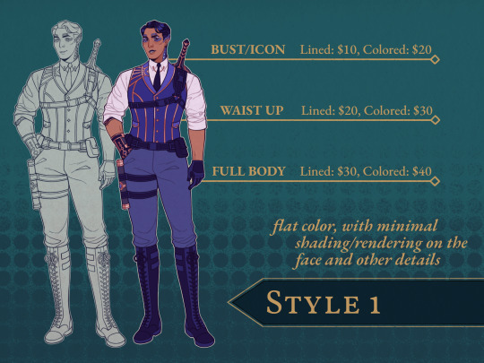

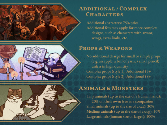


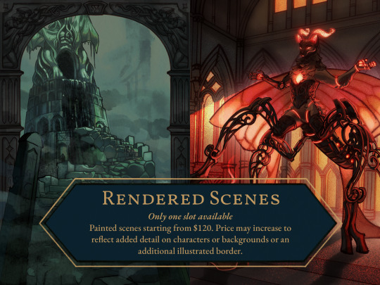
opening up commissions until the end of december. inquiries can be made through my google form, discord (ammonoideas), email ([email protected]), or DMs.
terms of service & price transcriptions beneath the cut
if you have any questions about any of the following, my tumblr asks & dms are open!
will draw:
original characters
fan art (see information section below)
furries/anthro
simple machinery/robots
moderate gore
suggestive content / nudity
won't draw:
complex machinery / mecha
extreme gore
outright nsfw content
information:
in regards to fan art, i prefer to only take commissions for media i am familiar with, and i may refuse commissions for media that i don't know particularly well or with which i am uncomfortable. if you're unsure about the media you're looking to commission fan art of, you can inquire via tumblr asks or dms.
i will not take commissions in a different art style from my own. this includes commissions where i would be asked to replicate the style of another artist.
overall, i reserve the right to refuse any commission whose contents i am uncomfortable with.
procedure:
after contacting me via google forms, discord, email, or dms, i will respond to accept, confirm, and provide a price for the commission.
payment will be done upfront via paypal invoice (accepts credit/debit cards, paypal, and venmo). i will send confirmation once the payment has been received.
i will send the rough sketch once it's complete and provide additional details such as a rough color palette if needed or requested.
refunds are only possible before the sketch has been completed.
during the process of completing the commission, i will provide work-in-progress images of the artwork at the line art stage, as well as the flat color and fully shaded stages if applicable to check if there are any changes you want to make to the piece at those points.
additional work-in-progress images will be provided alongside any requested alterations made to the artwork. if you would like progress images at any other point in the process, please let me know.
please provide reference images for the subject of your commission. these can include references for the kind of pose, prop, clothing, etc. you would like, but at least one reference for a character or individual being drawn is necessary.
these can be as simple or as complex as you can provide, as long as they are clear. i will not design a character from a written description of them.
you may, however, supplement reference images with written descriptions if there are certain details for which you do not have images.
terms:
the final product of the commission is a digital artwork, and is provided in the form of a PNG or JPG/JPEG file. no physical/material copy is provided.
the artist retains copyright over the finished artwork, as well as any work-in-progress images provided to the commissioner.
the rights to all characters or individuals featured in a commission are retained by their respective owners.
the commissioner may upload or share the final commission artwork on any social media platform, and credit is appreciate but not required. (if you do wish to credit me, i can be found at @bancaishi on instagram and tumblr.)
commissions are for private, non-commercial purposes only. the commissioner may not make use of a commission from me to make a profit, be it through selling/redistributing digitally or physically (as prints, merchandise, etc.). this also applies to NFTs.
commissions may not be used for the purpose or in the process of creating AI/machine-generated images.
the commissioner may not alter the commission without the artist's permission.
prices:
style 1
bust/icon - lined: $10, colored $20
waist up - lined: $20, colored: $30
full body - lined: $30, colored $40
style 2
bust/icon - lined: $15, colored: $30
waist up - lined: $30, colored: $45
full body - lined: $45, colored: $60
additional/complex characters
additional characters: 75% price
additional fees may apply for more complex designs, such as characters with armor, wings, extra limbs, etc.
props & weapons
no additional charge for small or simple props (e.g. an apple, a ball of yarn, a small pencil) unless in high quantity
complex props (style 1): additional $5+
complex props (style 2): additional $8+
animals & monsters
tiny animals (up to the size of a human hand): 20% on their own, free as a companion
small animals (up to the size of a cat): 30%
medium animals (up to the size of a dog): 50%
large animals (human size or larger): 100%
backgrounds
simple background: no additional cost
complex background (style 1): $20+
complex background (style 2): $30+
detailed background (style 1): $80+
detailed background (style 2): $100+
illustrated frames & borders
style 1: $10+
style 2: $15+
rendered scenes
only one slot available
painted scenes starting from $120. price may increase to reflect added detail on characters or backgrounds or an additional illustrated border
48 notes
·
View notes
Note
hi! cross stitcher here, I think this is a very cute concept but as it is the patterns are kind of unreadable due to the lack of gridding. are you planning on adding some way to count stitches/spaces in the future? jw!
Oh yes! Thank you for this ask-- short answer is "Yes, probably on Sunday!"
For the long answer, if I may be permitted to gush about the process for a moment… 😄
"What format should the samplers take?" is one of the main dilemmas that arose when building the bot. On the one hand, they need to 1. look beautiful, crisp, and legible, and on the other, they need to 2. be stitchable, but--
One of the earliest plans for the bot was for it to create full, complete patterns for each sampler: grid lines, symbols, and a key built into the bottom of the image-- basically recreating what WinStitch or PCStitch does. The key and symbols ideas never got off the ground (complicated to code), but I did get grid lines implemented.
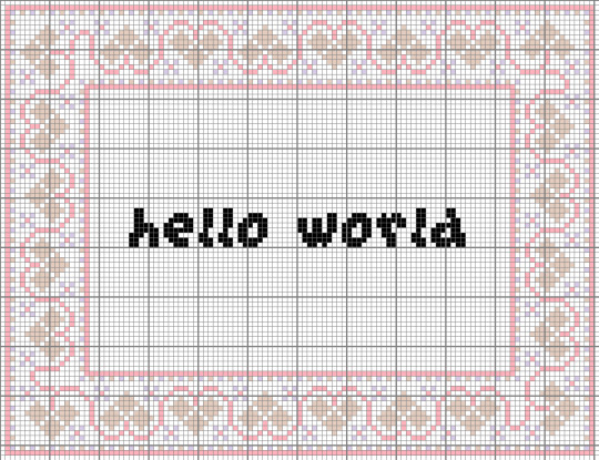
They don't look good, though.
I would consider this version of a sampler to be failing at both points 1 and 2, neither looking very good nor being actually that good to stitch from. The grey lines wash out the color and break up the image and text, and the absence of symbols (and to a lesser extent centering lines, a key, and line counts) makes it subpar to work off of.
So my plan is to make two versions of each sampler: one, generated by the bot and uploaded to tumblr, and the other processed manually by me, the human, through WinStitch, with keys and symbols and a Pattern Keeper version and all that jazz. Hopefully, the best of both worlds. :)
Straight up, I didn't think anyone would even find the bot until Sunday at the earliest, so I was planning to process the first batch of samplers and upload them then. 😅 I'm thinking a Ko-Fi gallery to host the PDFs, since it lets you do 'free/pay-what-you-want'. I'll drop the link to those here when I do!
Thank you for the ask! I'm very happy to see the bot get a warm reception here. ^_^
17 notes
·
View notes
Text
Hi, Tumblr folks. For the first time ever, I'm opening up emergency comms via Ko-Fi. Long story short, less hours at work, but not less expenses in life, is a BAD combination of things. Any & all help is appreciated, whether that's thru commissioning or reblogging!
I've never taken commissions, and I'm not exactly a prolific/active artist, so I don't have a comm sheet or any idea what to charge, soooo the current plan is: tell me what you want & make me an offer, then we'll go from there.
A few quick rules:
1. No proship content and no sexual stuff of underage characters. You ask me for this, your message is getting deleted and you're getting blocked.
2. No "draw a real person or animal from this photo in *insert cartoon or anime* style" requests, please. If you have a reference image of an already cartoonified version of say, yourself or your pet that you'd like art of, THAT I can work with.
3. I don't draw explicit content, but suggestive/some NSFW is on the table. It's on a case by case basis, and I will refuse anything I'm uncomfortable with. But generally speaking, if it's something you'd see in say, the non-edited versions of Tenchi or Outlaw Star, I probably can & will do it.
4. Please don't try to take advantage of the "name & negotiate your price" thing by, for example, offering me $2.00 for an idea with multiple characters, full color + shading & a complicated background. Please just... don't.
Now that the rules are covered, let's talk contact & payment info! My Ko-Fi link is above, and you can either message me there or send me an ask here on Tumblr. 😊 If you prefer sending payments through PayPal, Venmo or CashApp, those are as follows:
PayPal: @ MissLisaMiray
Venmo: @LisaMirayHayes
CashApp: $MissLisaMiray
If you've read this entire long-ass thing, THANK YOU. Your uh, reward is me shutting up & showing you some examples of stuff I've drawn/what I can do. I apologize if downloading stuff from my not-updated-in-4-years deviantArt account then uploading it to Tumblr kills the quality. I am currently away from home (where my original drawings and the files on my computer are), so I'm working with what I've got access to. 😅


#kofi#kofi commissions#emergency commisions open#tenchi muyo fanart#cowboy bebop fanart#rick and morty fanart#death note fanart#sailor moon fanart#bleach fanart#naruto fanart#el hazard fanart#traditional art#90's anime fanart#adult swim fanart#my art#traditional artist#adult swim#toonami#i can draw characters from series not pictured here too!#OCs are also fine so long as you provide references!#colored pencils and crayons and markers oh my!#can you tell i'm running out of tag ideas?#please help if you can#and if you can't help with money reblogs are a great help too!#besides financially helping this is probably just the thing to snap me out of art block#so many tags so little time#all artwork pictured is by me#commissions#let me draw stuff for you!#please reblog
14 notes
·
View notes